Need
Strategic and creative creation of the verbal and visual identity of the Inditex accessories chain.
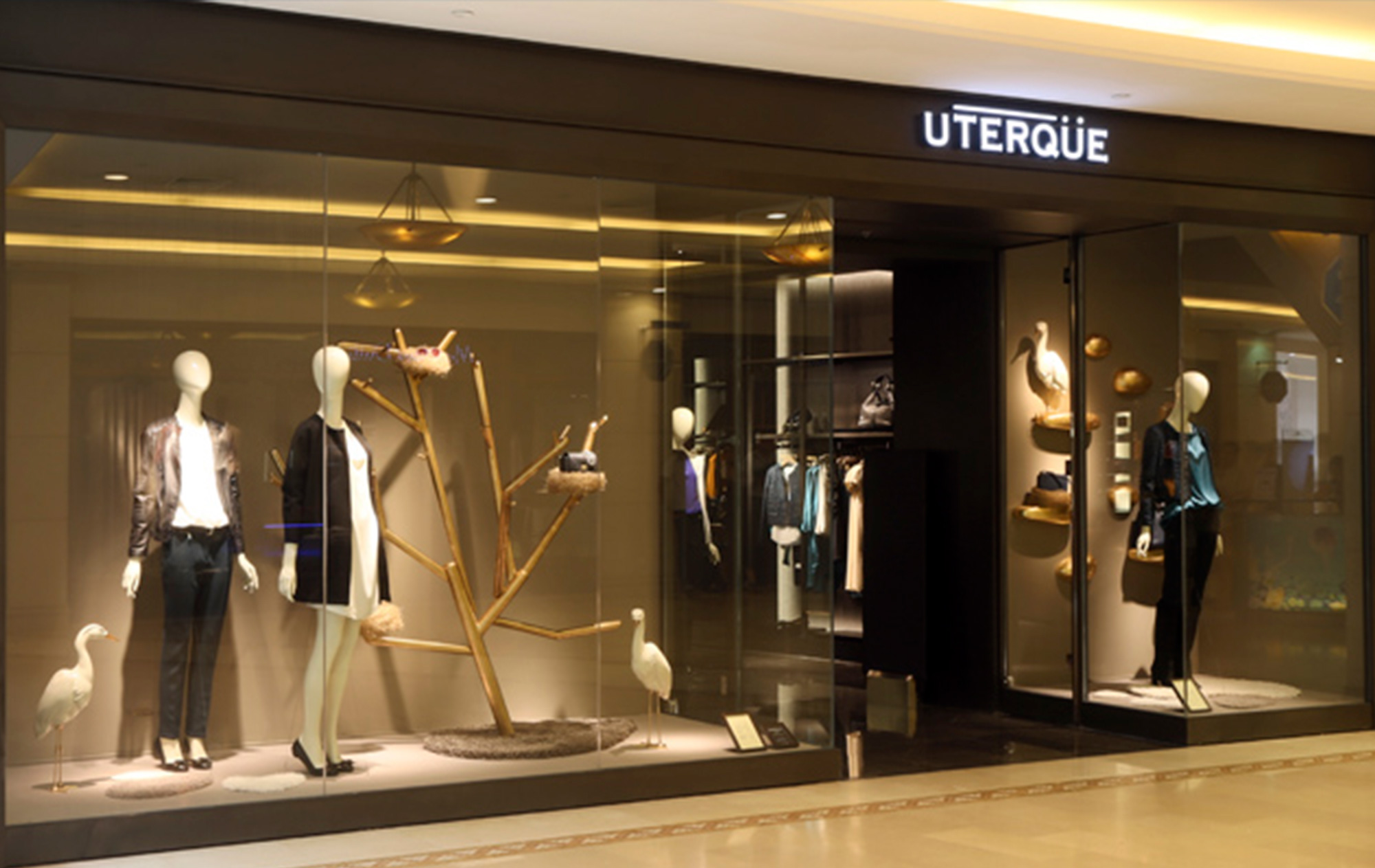
Expression of a product concept and point of sale for an average medium segment, but with a high aspirational component.
Result
As a fundamental part of the brand’s approach, it was pursued to generate emotions and values of its own, but within the general philosophy of the Group – closeness, simplicity – although taking into account the specific nuances of this chain: elegance and a certain sophistication,
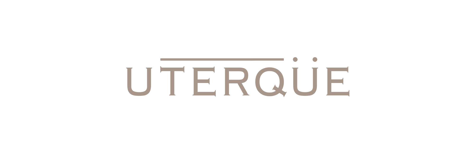
To materialize these messages, the first link was to define an appropriate naming line with the potential to be implemented in the different countries and languages. Thus UTERQÜE was born: a Latin word meaning One, The Other, Both. A term that expresses duality and universality.
With the brand’s visual identity, an elegant image was achieved due to its simplicity, timeless but cosmopolitan. Certain classicism also brings it closer to a perception of superior quality “.